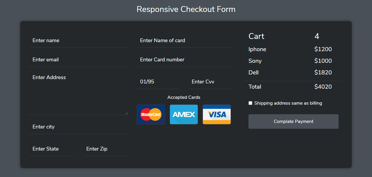
Responsive Checkout Form In Bootstrap 4
Template Name: Responsive Checkout Form In Bootstrap 4.
High Resolution: – Yes.
Compatible Browsers: – All Browser.
Source Files included: – HTML, Internal CSS, Images, and CDN.
The checkout form is mostly used on the eCommerce website or any selling product website. So here we design an awesome Responsive Checkout Form In Bootstrap 4 with CSS3 and HTML5.
In this form, we used a grid class of Bootstrap and also used utility classes like padding, margin, and alignment classes. Here we modify the input filed a class and also a button with custom colours. For making responsive we used media queries only for custom classes like padding-left & for container widths mobile-side.
To make the grid column full-width, we used bootstrap col-* classes. This is a fully responsive and mobile-friendly user interface.
Make it yours now by using it, downloading it, and please share it. we will design more elements for you.
Categories
- Javascript
- Vue.js
- Ui-Kit
- Typed.js
- Tailwind CSS
- Swiper.js
- Split.js
- Skeleton CSS
- Shoelace Style
- Shine.js
- Semantic-UI
- SASS/SCSS
- Rainyday.js
- Pug
- Php
- Particles.js
- PagePiling.js
- Page.js
- Nes-css
- Materialize CSS
- Material Angular
- Less CSS
- Website Layout
- Jquery
- Intro.js
- HTML 5 & CSS3
- FrontendMentor Challenges
- Freezeframe.js
- Foundation CSS
- Clone
- Bulma CSS
- Bootstrap
- Angular
- Tilt.js