Responsive Footer Using Tailwind CSS
Template Name: Responsive Footer Using Tailwind CSS.
High Resolution: – Yes.
Compatible Browsers: – All Browser.
Source Files included: – Html, Internal CSS, and Cdn.
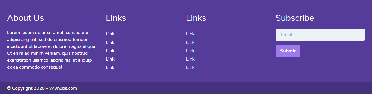
Tailwind gives you responsive components with huge CSS class collections. Previously, we made a login form and team section using Tailwind CSS. So here we designed a simple and responsive footer using Tailwind CSS.
In this element, we mostly used tailwind CSS components and classes. Here we used gird and also used utility classes. For making responsive we used responsive grid classes and also we used text colours with background colour classes. Also here we use form components to show subscribe form with submit button.
Make it yours now by using it, downloading it and please share it. we will design more elements for you.
Categories
- Javascript
- Vue.js
- Ui-Kit
- Typed.js
- Tailwind CSS
- Swiper.js
- Split.js
- Skeleton CSS
- Shoelace Style
- Shine.js
- Semantic-UI
- SASS/SCSS
- Rainyday.js
- Pug
- Php
- Particles.js
- PagePiling.js
- Page.js
- Nes-css
- Materialize CSS
- Material Angular
- Less CSS
- Website Layout
- Jquery
- Intro.js
- HTML 5 & CSS3
- FrontendMentor Challenges
- Freezeframe.js
- Foundation CSS
- Clone
- Bulma CSS
- Bootstrap
- Angular
- Tilt.js