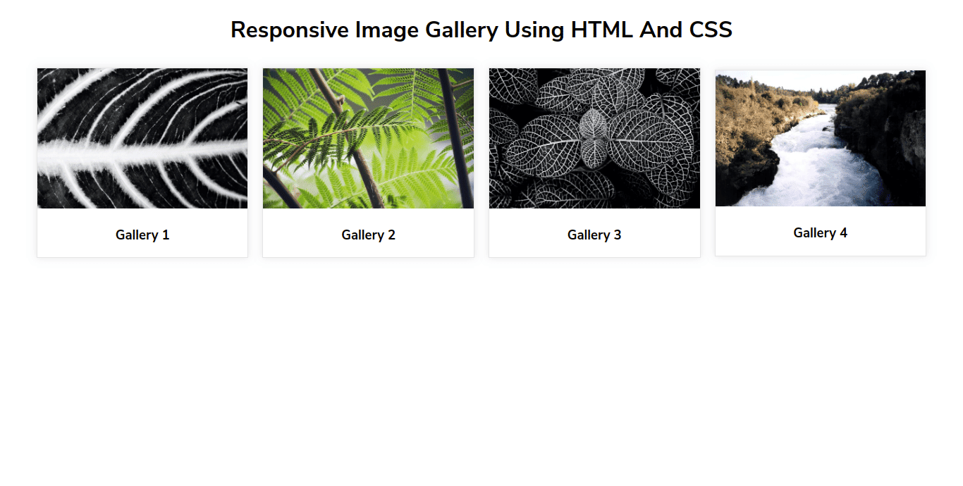
Responsive Image Gallery Using HTML And CSS
Template Name: Responsive Image Gallery Using HTML And CSS.
High Resolution: – Yes.
Compatible Browsers: – All Browser.
Source Files included: – HTML, CSS, and Images(Unsplash).
Responsive layouts are first priority for a web developer/designer. So here we design a responsive image gallery in HTML and CSS with an attractive user-friendly interface.
In this element, we used CSS flexbox properties with justify-content and alignment properties to make them perfectly aligned. Also, we used width properties for the column side, and for space we used margin. Here we also used box-shadow effects on the mouse hover case. To make it responsive we used media queries from 1000px to the mobile screen side.
Make it yours now by using it, downloading it, and please share it. we will design more elements for you.
Categories
- Javascript
- Vue.js
- Ui-Kit
- Typed.js
- Tailwind CSS
- Swiper.js
- Split.js
- Skeleton CSS
- Shoelace Style
- Shine.js
- Semantic-UI
- SASS/SCSS
- Rainyday.js
- Pug
- Php
- Particles.js
- PagePiling.js
- Page.js
- Nes-css
- Materialize CSS
- Material Angular
- Less CSS
- Website Layout
- Jquery
- Intro.js
- HTML 5 & CSS3
- FrontendMentor Challenges
- Freezeframe.js
- Foundation CSS
- Clone
- Bulma CSS
- Bootstrap
- Angular
- Tilt.js