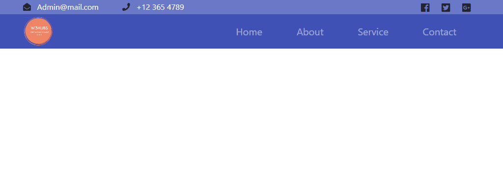
Responsive Navbar In Bootstrap 4
Template Name: Responsive Navbar In Bootstrap 4
High Resolution: – Yes.
Compatible Browsers: – All Browser.
Source Files included: – HTML and Internal CSS.
The responsive navbar is the best part of the Website. Navbar manages the entire part of the website and makes a user-friendly and understandable.
Here we design a simple and awesome navbar using Bootstrap 4 CSS framework and some css3 properties to make the navbar more beautiful and make the best look. Also, we used font awesome icons to show social icons and some basic icon like phone and mail icons. Here we changed the navbar color and used our own colors to make the more attractive navbar. This is fully responsive to mobile views.
Make it yours now by using it, downloading it, and please share it.
Categories
- Javascript
- Vue.js
- Ui-Kit
- Typed.js
- Tailwind CSS
- Swiper.js
- Split.js
- Skeleton CSS
- Shoelace Style
- Shine.js
- Semantic-UI
- SASS/SCSS
- Rainyday.js
- Pug
- Php
- Particles.js
- PagePiling.js
- Page.js
- Nes-css
- Materialize CSS
- Material Angular
- Less CSS
- Website Layout
- Jquery
- Intro.js
- HTML 5 & CSS3
- FrontendMentor Challenges
- Freezeframe.js
- Foundation CSS
- Clone
- Bulma CSS
- Bootstrap
- Angular
- Tilt.js