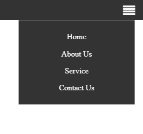
Responsive Navbar In CSS3
Template Name: Responsive Navbar In CSS3.
High Resolution: – Yes.
Compatible Browsers: – All Browser.
Source Files included: – HTML and Internal CSS.
Navbar manages the entire website menu and main pages of the whole website. Here we designed a fully responsive Navbar using CSS3 properties and used media queries to make mobile and tablet sides responsive.
Also Read:- Pricing Table In Tailwind CSS
In this element, we used a font-awesome icon after an 800px. When the user clicks on the icon, the menu will open on the right side.
Make it yours now by using it, downloading it, and please share it.
Categories
- Javascript
- Vue.js
- Ui-Kit
- Typed.js
- Tailwind CSS
- Swiper.js
- Split.js
- Skeleton CSS
- Shoelace Style
- Shine.js
- Semantic-UI
- SASS/SCSS
- Rainyday.js
- Pug
- Php
- Particles.js
- PagePiling.js
- Page.js
- Nes-css
- Materialize CSS
- Material Angular
- Less CSS
- Website Layout
- Jquery
- Intro.js
- HTML 5 & CSS3
- FrontendMentor Challenges
- Freezeframe.js
- Foundation CSS
- Clone
- Bulma CSS
- Bootstrap
- Angular
- Tilt.js