Tailwind CSS Interactive Responsive Navbar
Template Name: Tailwind CSS Interactive Responsive Navbar.
High Resolution: – Yes.
Compatible Browsers: – All Browser.
Source Files included: – HTML, Internal CSS, Jquery, and CDN.
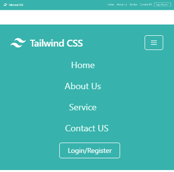
Nowadays Tailwind CSS is becoming more popular with the use of any javascript frameworks like Reactjs and Vuejs. But here we simply used the jQuery click function and also used the Tailwind CSS component and Utility classes.
This is a responsive element for mobile and tablet views. Here we mostly used Utility classes that are already given in this framework. Also for mobile toggle clickable, we use jQuery CDN and click function with the help of the toggle method. To make it responsive we didn't use any single line of CSS or media queries.
Make it yours now by using it, downloading it, and please share it. we will design more elements for you.
Categories
- Javascript
- Vue.js
- Ui-Kit
- Typed.js
- Tailwind CSS
- Swiper.js
- Split.js
- Skeleton CSS
- Shoelace Style
- Shine.js
- Semantic-UI
- SASS/SCSS
- Rainyday.js
- Pug
- Php
- Particles.js
- PagePiling.js
- Page.js
- Nes-css
- Materialize CSS
- Material Angular
- Less CSS
- Website Layout
- Jquery
- Intro.js
- HTML 5 & CSS3
- FrontendMentor Challenges
- Freezeframe.js
- Foundation CSS
- Clone
- Bulma CSS
- Bootstrap
- Angular
- Tilt.js